How to connect your rooms without a 'Red Thread'?
"The F word... Flow," Joa Studholme smiled. It’s a term thrown around constantly in interior design, usually followed by the idea of a "red thread"—a single colour or motif that runs through the entire house to tie it together.
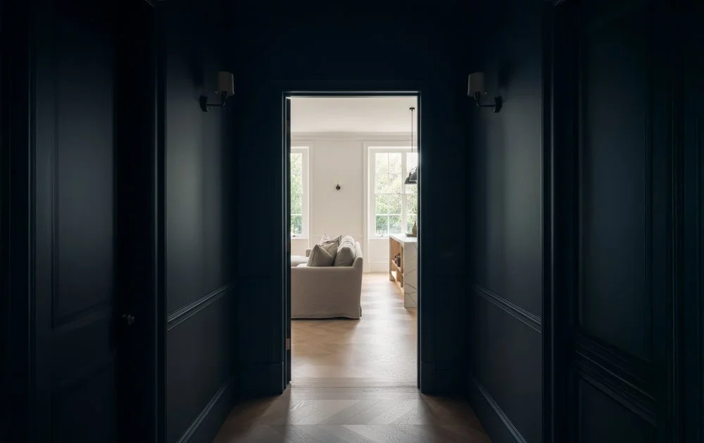
But the panel wasn't entirely convinced that a strict rules-based approach is necessary for Joa; the secret to flow lies in the hallway.
"If the hall is very strong, it gives you license for all the rooms off it to be very neutral," she explained. It creates a moment of compression before you release into the lighter spaces. Conversely, if you have a neutral hall, you want the rooms leading off it to have the same "weight" or density of colour so the transition feels natural.
“Virtually every front door is a different colour on the front and the back, and nobody worries about that.
Just embrace it.”
For Cassie, flow is less about colour and more about usability. She recalled a project where a client wanted a specific, massive fridge in a small townhouse kitchen.
"It becomes almost like an assault course," Cassie explained, describing how the fridge would have blocked the dishwasher. She noted that clients often only notice design when it fails. "You only notice the practical elements of design when it's wrong... if you've got a dishwasher that you open and it's in the way."
Joa agreed, applying the same logic to paint. "You don't notice colours if they're right. You only notice them when they're wrong."
Ultimately, whether it’s the layout of a kitchen or the shade of a skirting board, the goal is the same: a home that feels so right, you stop looking at the details and just start living in it.
PRO TIPS
The Inside / Outside Trick
(A quick way to connect the garden to the house)
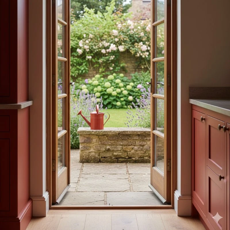
One of the simplest ways to strengthen the relationship between inside and outside is to let colour quietly cross the threshold. During the discussion, the panel talked about using colour not as a feature, but as a connector — for example, painting the inside of window reveals in a tone that subtly echoes the garden beyond. Greens can pull foliage visually into the room; warmer yellows can make a space feel sunnier, even on grey days. Because the colour sits within the depth of the opening, it reads as part of the architecture rather than decoration.
The same principle can work in reverse. A small, almost incidental gesture outside — a painted pot, watering can or bird box in a colour already used indoors — helps the eye move naturally between house and garden. It’s not about matching schemes, but about creating a gentle dialogue between spaces. When done well, the result isn’t something you consciously notice; the house simply feels more connected to its setting.
Pro tip: The ribbon of colour
A subtle way to link spaces without matching walls
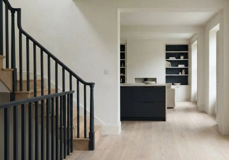
If using the same wall colour throughout a house feels too prescriptive, the panel discussed a quieter alternative: what Joa describes as a “ribbon” of colour. Rather than repeating colour across large surfaces, the idea is to introduce it sparingly and consistently, allowing it to reappear in small but deliberate moments as you move through the house.
The approach might begin with something as contained as staircase spindles painted in a strong, grounding colour such as Railings. That same colour can then reappear on the kitchen island, and later on the back of a bookcase in the living room. “It’s a little gentle reminder of where you are,” Joa explained. The colour doesn’t dominate any one room, but it quietly connects them, creating a sense of continuity without uniformity.