Why are Architect's Fearful of Bold Colour Palettes?
Why architects run a mile from bold palettes, and why the "sage green bathroom" still haunts our renovation dreams.
It’s one of the great debates of interior design: why are our homes so often painted in safe, muted tones? During our recent tactile workshop, Maddie from Hobson’s Choice put the question directly to the panel: "Do architects fear colour?"
"Definitely," laughed Helen Carey, Director of Hapticity Architects. "They run a mile when they see me!” added Joa.
“There are no overalls when it comes to colour... it’s all about what you feel comfortable with.”
According to Helen, this fear isn't born of boredom; it’s born of responsibility. Architects aren’t thinking about next season’s trends; they are thinking about the next century. "We are designing for a long period of time," Helen explained. "We're expecting [projects] to have a lifespan of 50 years, if not a hundred years. If you go in with bold colours, they're not necessarily going to last. They can be quite fashion-led."
Cassie Nelson-Hall, a designer at Hobson’s Choice, agreed, noting that kitchens share a similar need for longevity. "We design them for about 20 years," she said. "You need to make sure that what you choose is going to... you’re going to love it tomorrow and for 20 years."
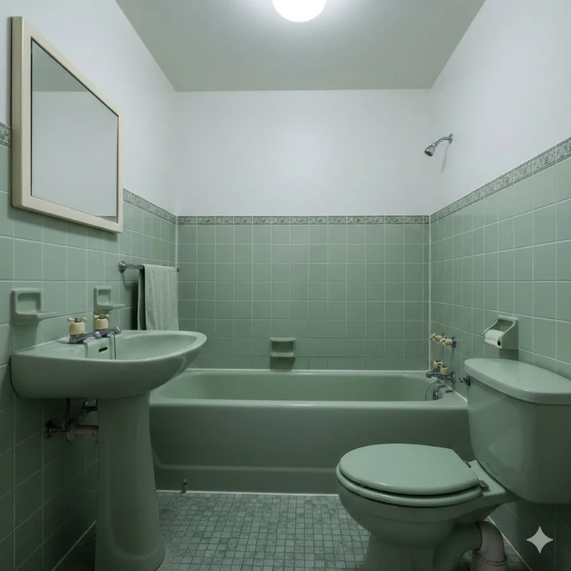
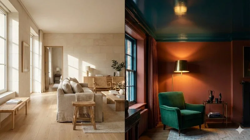
The audience clearly resonated with this. One guest pointed out that it’s not really a fear of colour, but a fear of being dated—citing the "dreaded sage green bathroom" of yesteryear that instantly ages a property.
So, how do we stop our homes from becoming time capsules? Joa Studholme, Colour Curator at Farrow & Ball, offered a liberating perspective. While architecture and joinery need to stand the test of time, paint is transient.
"I’m looking at possibly five years," Joa said regarding how often people repaint. "There are no overalls when it comes to colour... it’s all about what you feel comfortable with."
The consensus? If the bones of the house—the "design generator," as Helen calls it—are right, the colour will follow.
THE ‘COCOON’ CASE STUDY
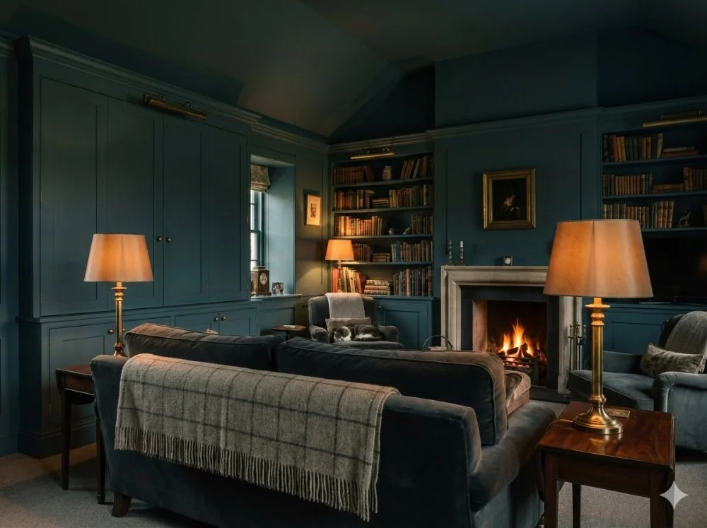
Proof that bold colour doesn't date? Helen Carey shared a story about a project from 2011 where Joa painted a drawing room in a deep, dark blue (likely Inchyra Blue).
"The client said she goes in there and it’s like a cocoon," Helen recalled. "She goes in there, relaxes, and falls asleep invariably." Despite renovating other parts of the house, that room has stayed exactly the same for over a decade. "It stayed the same because it was right," says Helen.
If you would like to find out more and watch the full Q&A event, click on the button below.