Why are materials, not paint, becoming the new feature walls?
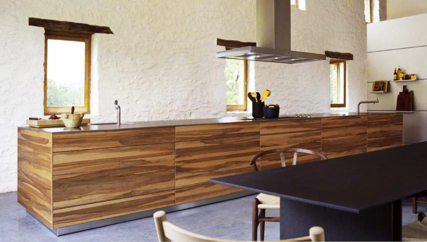
“This is the material that’s bringing the colour,” said Cassie Nelson-Hall, pointing to an image of a kitchen clad in Apple Wood. Rather than relying on painted surfaces, the panel discussion repeatedly returned to the idea that texture and material can carry colour on their own.
In this example, Cassie described the use of timber not as a backdrop, but as the defining visual element. Apple Wood, with its natural warmth and variation, became the colour in the space. The effect was intentional and controlled, particularly through the use of what she described as “mismatched book-matching” — where the grain is deliberately offset rather than mirrored.
“It’s intentionally doing it so that it’s mismatched,” she explained, avoiding a finish that feels too perfect or overly designed.
“You just do not want to be conscious of it… you don’t want to see the colour.”
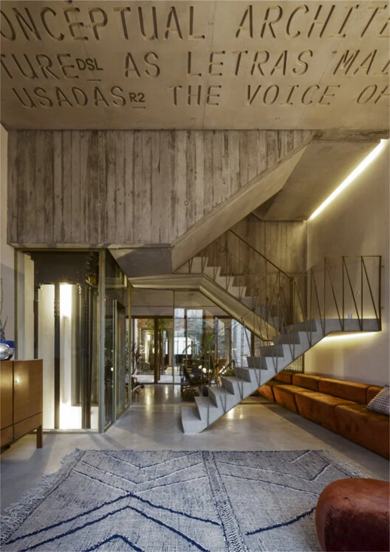
The conversation then moved from joinery to structure. Helen Carey referenced the Typografia do Conto hotel project in Porto, where material honesty was central to the design approach. In the concrete structure, the architects left the “shuttering imprint on the concrete”, allowing the construction process itself to remain visible.
“If that had been another smooth concrete finish, it would be pretty bland,” Helen noted. By contrast, the retained shuttering marks show “how the hand of man has made this building”, adding depth and character without decorative layers.
Helen’s Advice - Softening the Hard Edges
If you are using industrial materials like concrete or stainless steel, Helen warns against the space becoming "sterile." To bring in the "human element," she suggests:
Velvet: A "soft luxury" fabric that invites you to sit.
Brass: Elegant handrails or hardware to offset cold grey tones.
Wood: Used in courtyards or panelling to add warmth to concrete structures.
image credit: Archdaily
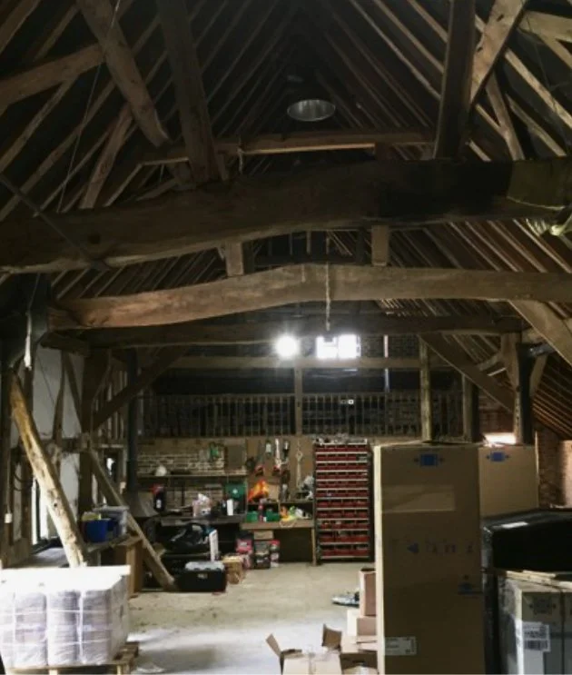
The question of contrast became more pointed when the panel discussed a barn conversion project, defined by crooked beams and what Helen described as an “intrinsically not straight” roof. Rather than trying to disguise or soften those irregularities, Cassie suggested a more deliberate response.
“Why not exaggerate the fact that it’s completely different?” she said. “Have really dead straight lines and really exaggerate it.”
That idea — placing clean, contemporary elements into a historic, irregular structure — relies heavily on restraint elsewhere. When the discussion turned to colour, Joa was clear about the risk of overstatement.
“If you notice the colour in this building, we’ve failed,” she said of the barn. “You just do not want to be conscious of it… you don’t want to see the colour.”
Instead, the panel emphasised working with existing materials — brick, timber, mortar — and allowing kitchens and joinery to sit quietly within that context. Colour still plays a role, but often indirectly, through material choice rather than paint.
As the discussion concluded, one idea stood out: sometimes the most successful design decisions are the least visible ones. When material, structure and proportion are right, colour doesn’t need to announce itself at all.
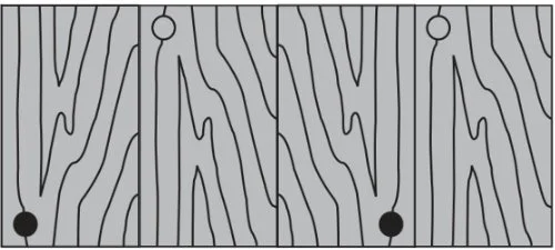
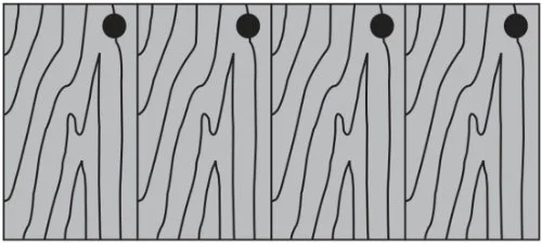
WHAT IS BOOK-MATCHING
Cassie mentioned this technique regarding the Apple Wood kitchen. It’s when wood veneers are matched so the grain continues seamlessly from one cupboard door to the next. However, for a more organic look, Cassie sometimes intentionally "mismatches" them to stop it looking too uniform.
CONSECUTIVE
BOOK-MATCHED
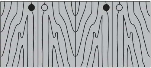
UNSORTED