Why are WE STILL FIGHTING THE LIGHT?
Joa Studholme on why you can’t fight nature, the return of yellow, and the unexpected joy of a gloss ceiling.
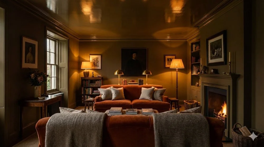
"There is nothing I love more than a gloss ceiling," Joa Studholme declared to the audience. It’s a bold statement, but Joa has the history to back it up. "I think maybe I was brought up in a sort of pub," she joked, recalling how pubs used gloss to wipe down nicotine stains. Today, however, she uses it for a different reason: "It bounces the light around."
Lighting was a central theme of the evening. When it comes to choosing colours, Joa’s advice was simple: stop fighting the room.
“There is no point in fighting nature, if you have a dark space, go with it.”
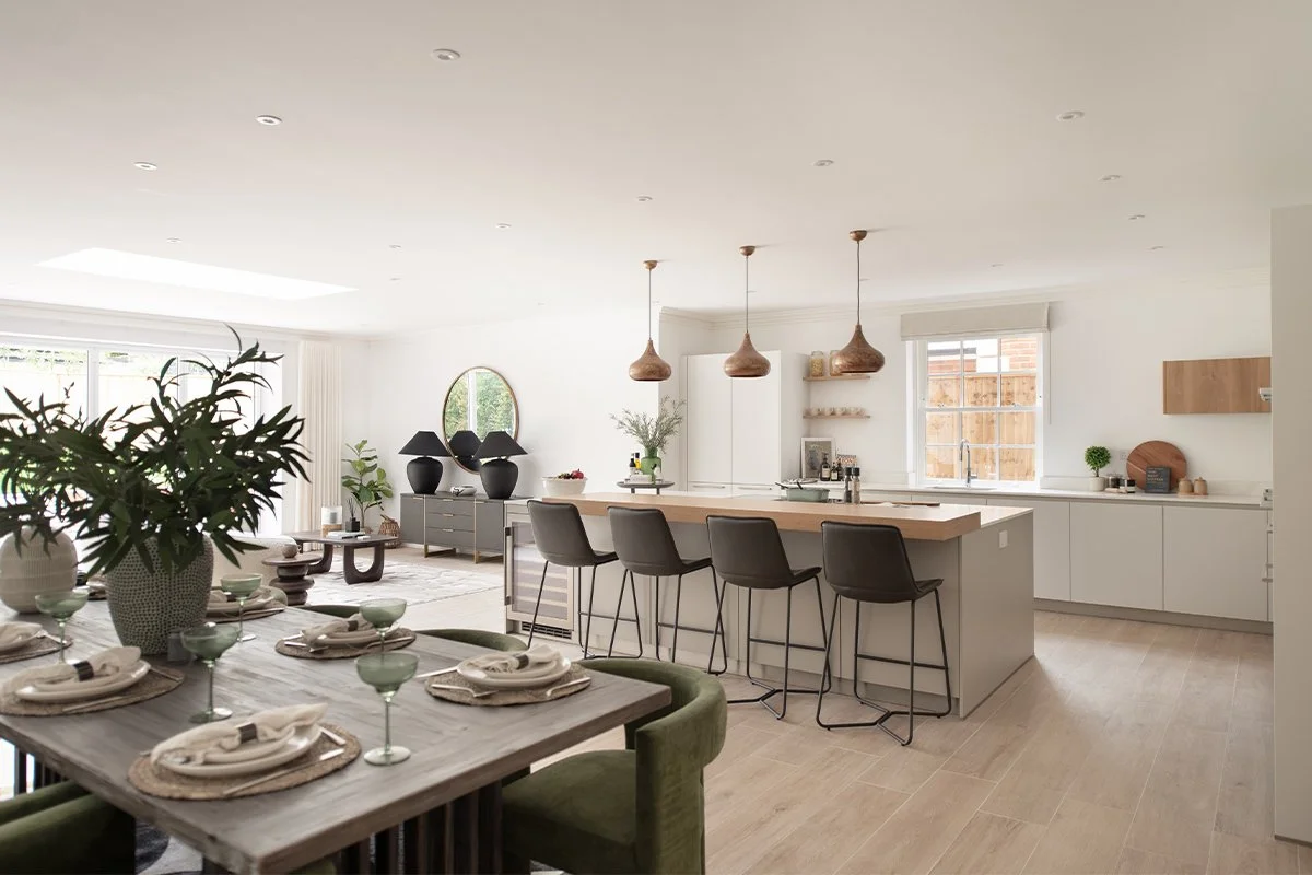
“There is no point in fighting nature," she said. "If you have a dark space, go with it." Her suggestion? Use lighter colours in the kitchen where you work during the day, but embrace the dark in the evening. A dark room, she explained, will "give you a great big hug and make your shoulders go down."
But before you pick up a paintbrush, you need to understand your neutrals. Joa described it as her "life’s mission for the last 20, 30 years," categorising them into groups based on undertone.

While grey-based neutrals have dominated the last decade ("a monster of our making," Joa admitted wryly), she predicts a shift. "These are the yellow-based neutrals which have gone incredibly out of fashion," she said, pointing to the warmer tones. "But mark my words, we will be back with these... people are really rejecting [the greys] and coming right back to here because they feel like they’re related to nature."
Whether you’re looking for a "hug" in a dark room or a sun-filled kitchen, the panel agreed: light changes everything. As Cassie noted, natural light shifts throughout the day, while artificial light changes the game entirely. The trick is to watch the colour change and enjoy the show.
JOA’S NEUTRAL CHEAT SHEET
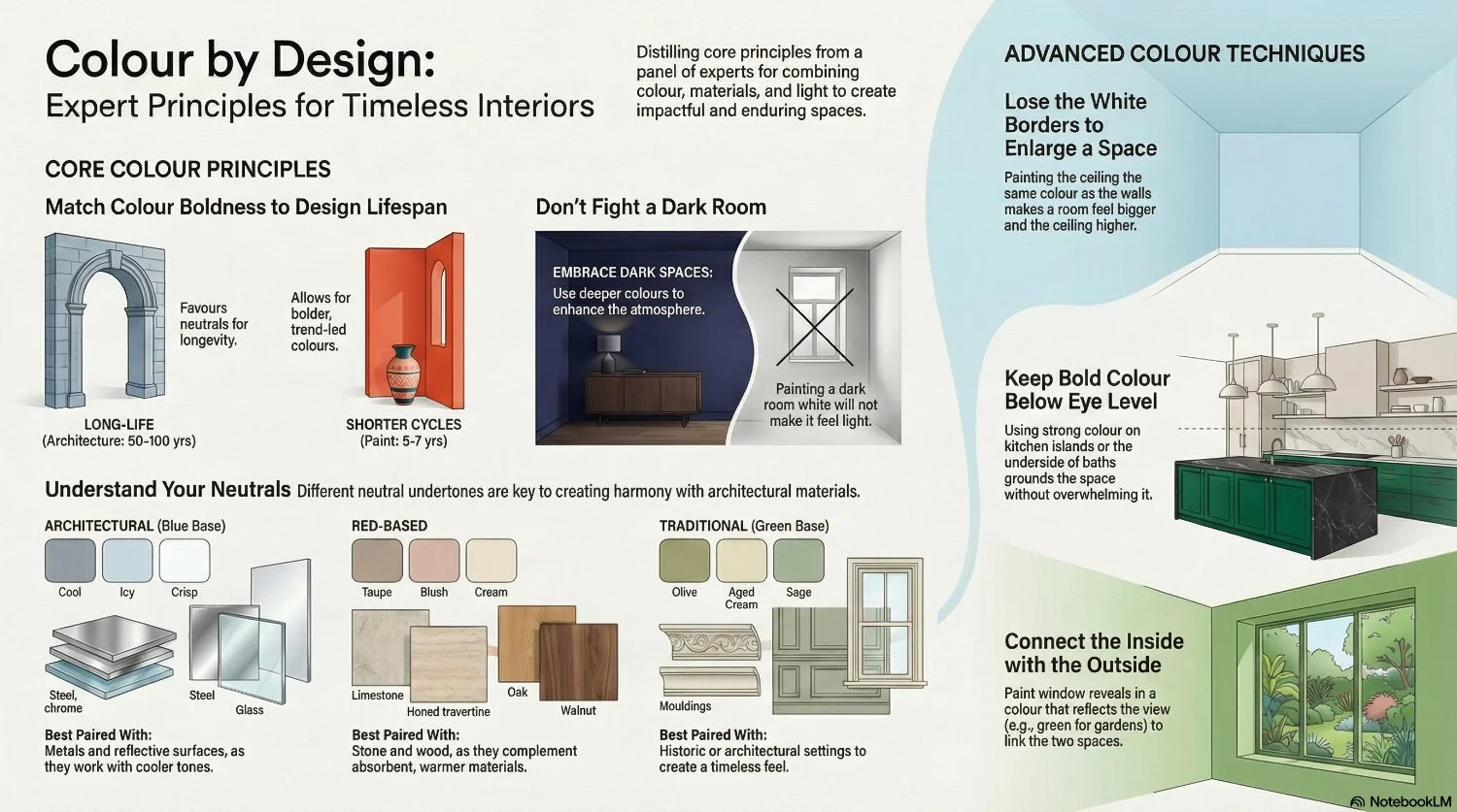
Joa’s 4 Neutral Families
Traditional Neutrals: Green-based. They look like they’ve been there forever.
Architectural Neutrals: Blue-based. Cool, crisp, and perfect for modern metal finishes.
Red-Based Neutrals: Warm and light-absorbing. The best friends of stone and wood.
Yellow-Based Neutrals: The comeback kids. "Mark my words," says Joa, "we will be back with these warm, nature-related tones."
Case Study: Using Colour to Transform Light in a Historic Room
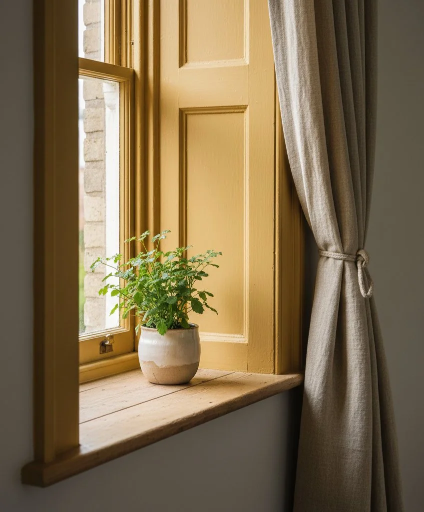
This property is an older, characterful building with deep-set windows, thick walls and limited direct sunlight. Although rich in texture and architectural detail, one of the rooms felt subdued and darker than desired, particularly during overcast days.
Rather than altering the structure or increasing artificial lighting, the update focused on a subtle but deliberate use of colour.
The design decision
Instead of painting the walls or introducing bold colour across the room, a warm yellow tone was applied solely to the inside of the window reveals.
The colour was carefully chosen:
Not a bright or primary yellow
Soft, muted, and slightly earthy
Intended to feel like reflected light rather than decoration
Crucially, the colour was confined to the reveal itself — not the surrounding walls — allowing it to act as an accent rather than a feature.